Visualizing Data in R with Default Package:
Curve and RColorBrewer
Asst. Prof. Dr. Somsak Chanaim
International College of Digital Innovation, CMU
June 23, 2026
My Shiny App
Interactive Example
viewof curveType = Inputs.radio(
[
"Histogram + Density Curve",
"Histogram + Normal Curve",
"Histogram + Density & Normal",
"ECDF Curve",
"Cumulative Histogram (Ogive)",
"Function Curve: sin(x)",
"Function Curve: exp(x)",
"Function Curve: quadratic"
],
{ label: "Curve Demos (Base R)", value: "Histogram + Density Curve", inline: true }
)
Draw in Curve in R
The curve() function in R is used to plot mathematical functions over a specified interval.
It’s particularly useful for visualizing the shape of a function or for adding function curves to existing plots.
The curve() function is a powerful tool for visualizing mathematical expressions and functions directly in R.
Built-in mathematical functions
R has hundreds of built-in mathematical functions, and most of them come from its base and stats packages (which load automatically).
1. Basic Arithmetic
| Function | Example | Meaning |
|---|---|---|
+ - * / |
5 + 2, 8 / 4 |
Addition, subtraction, multiplication, division |
^ or ** |
3^2 |
Power |
%% |
5 %% 2 |
Modulus (remainder) |
%/% |
5 %/% 2 |
Integer division |
2. Rounding and Integer Functions
| Function | Example | Description |
|---|---|---|
round(x, n) |
round(3.14159, 2) → 3.14 |
Round to n digits |
ceiling(x) |
ceiling(3.2) → 4 |
Round up |
floor(x) |
floor(3.8) → 3 |
Round down |
trunc(x) |
trunc(-3.9) → -3 |
Truncate decimals |
signif(x, n) |
signif(1234, 2) → 1200 |
Round to significant digits |
abs(x) |
abs(-5) → 5 |
Absolute value |
sign(x) |
sign(-10) → -1 |
Sign of number |
3. Exponential and Logarithmic
| Function | Example | Description |
|---|---|---|
exp(x) |
exp(1) → e |
Exponential function |
log(x) |
log(10) → ln(10) |
Natural log (base e) |
log10(x) |
log10(100) → 2 |
Log base 10 |
log2(x) |
log2(8) → 3 |
Log base 2 |
4. Trigonometric Functions
| Function | Example | Description |
|---|---|---|
sin(x), cos(x), tan(x) |
sin(pi/2) → 1 |
Trig functions (radians) |
asin(x), acos(x), atan(x) |
atan(1) → π/4 |
Inverse trig |
sinh(x), cosh(x), tanh(x) |
Hyperbolic functions | |
asinh(x), acosh(x), atanh(x) |
Inverse hyperbolic |
5. Statistical & Aggregation
| Function | Example | Description |
|---|---|---|
sum(x) |
sum(1:5) → 15 |
Sum |
mean(x) |
mean(c(2,4,6)) → 4 |
Arithmetic mean |
median(x) |
median(c(1,9,3)) → 3 |
Median |
var(x), sd(x) |
sd(1:5) → 1.58 |
Variance / SD |
min(x), max(x) |
Minimum / Maximum | |
range(x) |
Range (min & max) | |
quantile(x, p) |
quantile(x, 0.25) |
Quantiles |
sum(is.na(x)) |
Count missing values |
6. Complex Numbers
| Function | Example | Description |
|---|---|---|
complex(real, imaginary) |
complex(real=2, imaginary=3) |
Create complex number |
Re(z) / Im(z) |
Extract real / imaginary parts | |
Mod(z) |
Magnitude | |
Arg(z) |
Argument (angle) | |
Conj(z) |
Conjugate |
7. Sequences and Random Numbers
| Function | Example | Description |
|---|---|---|
seq(from, to, by) |
seq(1,10,2) |
Sequence |
rep(x, times) |
rep(1:3, 2) |
Repeat |
runif(n, min, max) |
runif(5, 0, 1) |
Uniform random numbers |
rnorm(n, mean, sd) |
rnorm(5, 0, 1) |
Normal random numbers |
sample(x, size) |
sample(1:10, 3) |
Random sample |
8. Matrix and Linear Algebra
| Function | Example | Description |
|---|---|---|
matrix(data, nrow, ncol) |
Create matrix | |
t(A) |
Transpose | |
%*% |
Matrix multiplication | |
solve(A, b) |
Solve linear system | |
det(A) |
Determinant | |
eigen(A) |
Eigenvalues & vectors | |
diag(x) |
Diagonal matrix | |
rowSums(A), colSums(A) |
Sum by row/column |
9. Special Mathematical Functions
| Function | Example | Description |
|---|---|---|
factorial(n) |
factorial(5) → 120 |
Factorial |
choose(n, k) |
choose(5,2) → 10 |
Binomial coefficient |
gamma(x) / lgamma(x) |
Gamma function / log(Γ(x)) | |
digamma(x) / trigamma(x) |
Derivatives of Γ(x) | |
beta(a,b) |
Beta function |
10. Useful Constants
| Constant | Meaning |
|---|---|
pi |
π = 3.14159… |
Inf, -Inf |
Infinity |
NA |
Missing value |
NaN |
Not a number |
.Machine$double.eps |
Machine precision (~2.22e-16) |
Basic Syntax
Parameters:
expr: The mathematical expression to plot. This can be a function or an expression in terms ofx.from: The starting value ofxfor which the function will be plotted.to: The ending value ofxfor which the function will be plotted.add: IfTRUE, the curve will be added to an existing plot. IfFALSE(default), a new plot will be created.col: The color of the curve.
Example 1: Plotting a Simple Function
Let’s plot the function \(y = x^2\) over the interval [-10, 10].
Note: If we want to hide the box around the graph, we can set the argument bty = "n".
Example 2: Adding a Curve to an Existing Plot
You can add a curve to an existing plot by setting
add = TRUE.
The
lwdargument controls the thickness of lines in plots.A larger
lwdvalue increases the line thickness, while a smaller value decreases it.You can use
lwdin any function that involves drawing lines, such asplot(),curve(),lines(), andabline().
Example 3: Plotting a Custom Function
You can also plot a custom function using the curve() function.
In R, the lty argument is used in plotting functions to specify the line type, such as solid, dashed, or dotted.
The common values for lty:
0: Blank (no line)
1: Solid line (default)
2: Dashed line
3: Dotted line
4: Dot-dash line
5: Long-dash line
6: Two-dash line
Question
From the example above change the lty from 1 to another number.
Draw the curve from 10 functions
1. Linear Function:
\[ y = 2x + 1 ,~ x\in[-5,5] \]
2. Quadratic Function:
\[ y = x^2 - 4x + 3,~ x\in[-5,10] \]
3. Cubic Function:
\[ y = x^3 - 3x^2 + 2,~ x\in[-5,5] \]
4. Exponential Function:
\[ y = e^{-0.5x} ,~ x\in[-5,5] \]
5. Logarithmic Function:
\[ y = \log(x) ,~ x\in[0.001,10] \]
6. Sine Function:
\[ y = \sin(x),~ x\in[-4\pi,4\pi] \]
7. Cosine Function:
\[ y = \cos(x) ~ x\in[-4\pi,4\pi] \]
8. Tangent Function:
\[ y = \tan(x), ~ x\in[-4\pi,4\pi] \]
9. Reciprocal Function:
\[ y = \frac{1}{x}, ~ x\in[0.0001,2] \]
10. Gaussian (Normal) Distribution:
\[y = \frac{1}{\sqrt{2\pi}} e^{-\frac{x^2}{2}},~ x\in[-4,4]\]
Add the legend in the curve plot
Sine function:
\[ y = \sin(x),~ x\in[-4\pi,4\pi] \]
Cosine function:
\[ y = \cos(x) ~ x\in[-4\pi,4\pi] \]
Exercise 1: Basic Curve Plotting
Complete the script to evaluate a quadratic mathematical function over a specified interval and assign the proper axis labels.
Target output
Complete the code
(x^2, = -10, = 10,
xlab = "x values",
ylab = "y values",
main = "Plot of y = x^2")
xlab = "x values",
ylab = "y values",
main = "Plot of y = x^2")
Hint: Invoke the native curve() function to evaluate mathematical expressions. Specify the structural domain interval boundaries using the 'from' and 'to' arguments.
viewof var_ex1_basic_curve_plotting_1 = html`<input type="text" class="ojs-hidden-ex1_basic_curve_plotting" data-ojs-proxy="ex1_basic_curve_plotting::var_ex1_basic_curve_plotting_1" value="">`
viewof var_ex1_basic_curve_plotting_2 = html`<input type="text" class="ojs-hidden-ex1_basic_curve_plotting" data-ojs-proxy="ex1_basic_curve_plotting::var_ex1_basic_curve_plotting_2" value="">`
viewof var_ex1_basic_curve_plotting_3 = html`<input type="text" class="ojs-hidden-ex1_basic_curve_plotting" data-ojs-proxy="ex1_basic_curve_plotting::var_ex1_basic_curve_plotting_3" value="">`
viewof var_ex1_basic_curve_plotting_run = html`<input type="number" class="ojs-hidden-ex1_basic_curve_plotting" data-ojs-run="ex1_basic_curve_plotting" value="0">`
Exercise 2: Superimposing Multiple Functional Curves
Complete the script to plot an initial cubic function and layer a secondary function over the same graphical space using a customized palette.
Target output
Complete the code
curve(x^3, from = -2, to = 2, = "blue", main = "Multiple Curves")
curve(x^2, from = -2, to = 2, col = "red", = TRUE)
curve(x^2, from = -2, to = 2, col = "red", = TRUE)
Hint: Use the 'col' argument to assign line colors. To force a secondary curve to overlay onto the existing viewport canvas without refreshing the window, set 'add = TRUE'.
viewof var_ex2_adding_multiple_curves_1 = html`<input type="text" class="ojs-hidden-ex2_adding_multiple_curves" data-ojs-proxy="ex2_adding_multiple_curves::var_ex2_adding_multiple_curves_1" value="">`
viewof var_ex2_adding_multiple_curves_2 = html`<input type="text" class="ojs-hidden-ex2_adding_multiple_curves" data-ojs-proxy="ex2_adding_multiple_curves::var_ex2_adding_multiple_curves_2" value="">`
viewof var_ex2_adding_multiple_curves_run = html`<input type="number" class="ojs-hidden-ex2_adding_multiple_curves" data-ojs-run="ex2_adding_multiple_curves" value="0">`
Exercise 3: Plotting a Custom Damped Function
Complete the script to evaluate a composite mathematical function over a specified interval, applying a dashed line style and custom colors.
Target output
Complete the code
curve((x) * (-0.1 * x), from = 0, to = 20,
col = "blue",
= 2,
ylab = "f(x)",
main = "Plot of f(x) = sin(x) * exp(-0.1x)")
col = "blue",
= 2,
ylab = "f(x)",
main = "Plot of f(x) = sin(x) * exp(-0.1x)")
Hint: Use the native 'sin()' and 'exp()' functions to construct the composite expression. To modify the structural line style to dashed, assign the value 2 to the 'lty' (line type) parameter.
viewof var_ex3_plotting_custom_function_1 = html`<input type="text" class="ojs-hidden-ex3_plotting_custom_function" data-ojs-proxy="ex3_plotting_custom_function::var_ex3_plotting_custom_function_1" value="">`
viewof var_ex3_plotting_custom_function_2 = html`<input type="text" class="ojs-hidden-ex3_plotting_custom_function" data-ojs-proxy="ex3_plotting_custom_function::var_ex3_plotting_custom_function_2" value="">`
viewof var_ex3_plotting_custom_function_3 = html`<input type="text" class="ojs-hidden-ex3_plotting_custom_function" data-ojs-proxy="ex3_plotting_custom_function::var_ex3_plotting_custom_function_3" value="">`
viewof var_ex3_plotting_custom_function_run = html`<input type="number" class="ojs-hidden-ex3_plotting_custom_function" data-ojs-run="ex3_plotting_custom_function" value="0">`
Exercise 4: Logarithmic Domain Interval Exploration
Complete the script to evaluate a logarithmic function across expanding intervals, layer the subsequent curves, and position an explanatory legend.
Target output
Complete the code
curve((x), from = 0.1, to = 10, col = "blue", log = "x", ylab = "log(x)", main = "Plot of y = log(x) over different intervals")
curve(log(x), from = 1, to = 100, col = "red", = TRUE)
curve(log(x), from = 10, to = 1000, col = "green", add = TRUE)
("", legend = c("[0.1, 10]", "[1, 100]", "[10, 1000]"), col = c("blue", "red", "green"), lty = 1)
curve(log(x), from = 1, to = 100, col = "red", = TRUE)
curve(log(x), from = 10, to = 1000, col = "green", add = TRUE)
("", legend = c("[0.1, 10]", "[1, 100]", "[10, 1000]"), col = c("blue", "red", "green"), lty = 1)
Hint: Invoke 'log()' for the mathematical evaluation. Enforce 'add = TRUE' to layer curves on the existing canvas. Call the legend() function and pass a precise position string like 'topleft' to allocate the map key.
viewof var_ex4_exploring_intervals_1 = html`<input type="text" class="ojs-hidden-ex4_exploring_intervals" data-ojs-proxy="ex4_exploring_intervals::var_ex4_exploring_intervals_1" value="">`
viewof var_ex4_exploring_intervals_2 = html`<input type="text" class="ojs-hidden-ex4_exploring_intervals" data-ojs-proxy="ex4_exploring_intervals::var_ex4_exploring_intervals_2" value="">`
viewof var_ex4_exploring_intervals_3 = html`<input type="text" class="ojs-hidden-ex4_exploring_intervals" data-ojs-proxy="ex4_exploring_intervals::var_ex4_exploring_intervals_3" value="">`
viewof var_ex4_exploring_intervals_4 = html`<input type="text" class="ojs-hidden-ex4_exploring_intervals" data-ojs-proxy="ex4_exploring_intervals::var_ex4_exploring_intervals_4" value="">`
viewof var_ex4_exploring_intervals_run = html`<input type="number" class="ojs-hidden-ex4_exploring_intervals" data-ojs-run="ex4_exploring_intervals" value="0">`
Exercise 5: Advanced Graphical Layer Annotations
Complete the script to map a continuous square root curve, superimpose discrete coordinate points, and append spatial text annotations.
Target output
Complete the code
(sqrt(x), from = 0, to = 25,
col = "purple",
ylab = "sqrt(x)",
main = "Plot of y = sqrt(x) with points and annotations")
(c(5, 10, 15, 20), sqrt(c(5, 10, 15, 20)),
pch = 19,
col = "red")
(c(5, 10, 15, 20), sqrt(c(5, 10, 15, 20)) + 0.5,
= c("(5, sqrt(5))", "(10, sqrt(10))", "(15, sqrt(15))", "(20, sqrt(20))"),
pos = 3)
col = "purple",
ylab = "sqrt(x)",
main = "Plot of y = sqrt(x) with points and annotations")
(c(5, 10, 15, 20), sqrt(c(5, 10, 15, 20)),
pch = 19,
col = "red")
(c(5, 10, 15, 20), sqrt(c(5, 10, 15, 20)) + 0.5,
= c("(5, sqrt(5))", "(10, sqrt(10))", "(15, sqrt(15))", "(20, sqrt(20))"),
pos = 3)
Hint: Render the foundational mathematical baseline using curve(). To overlay specific coordinate nodes, deploy the points() function. Finally, instantiate text elements using text() paired with the explicit 'labels' character vector.
viewof var_ex5_points_annotations_1 = html`<input type="text" class="ojs-hidden-ex5_points_annotations" data-ojs-proxy="ex5_points_annotations::var_ex5_points_annotations_1" value="">`
viewof var_ex5_points_annotations_2 = html`<input type="text" class="ojs-hidden-ex5_points_annotations" data-ojs-proxy="ex5_points_annotations::var_ex5_points_annotations_2" value="">`
viewof var_ex5_points_annotations_3 = html`<input type="text" class="ojs-hidden-ex5_points_annotations" data-ojs-proxy="ex5_points_annotations::var_ex5_points_annotations_3" value="">`
viewof var_ex5_points_annotations_4 = html`<input type="text" class="ojs-hidden-ex5_points_annotations" data-ojs-proxy="ex5_points_annotations::var_ex5_points_annotations_4" value="">`
viewof var_ex5_points_annotations_run = html`<input type="number" class="ojs-hidden-ex5_points_annotations" data-ojs-run="ex5_points_annotations" value="0">`
Interactive RColorBrewer
viewof palType = Inputs.radio(
["Sequential", "Diverging", "Qualitative"],
{ label: "Palette Type", value: "Sequential", inline: true }
)

// mapping palettes ต่อประเภท (ใช้ array literal ได้)
sequentialPals = [
"Blues","BuGn","BuPu","GnBu","Greens","Greys","Oranges","OrRd",
"PuBu","PuBuGn","PuRd","Purples","RdPu","Reds",
"YlGn","YlGnBu","YlOrBr","YlOrRd"
]
divergingPals = [
"BrBG","PiYG","PRGn","PuOr","RdBu","RdGy","RdYlBu","RdYlGn","Spectral"
]
qualitativePals = [
"Accent","Dark2","Paired","Pastel1","Pastel2","Set1","Set2","Set3"
]

// สร้าง mapping function (แทนการใช้ object literal)
function getPalList(type) {
if (type === "Sequential") return sequentialPals;
if (type === "Diverging") return divergingPals;
if (type === "Qualitative") return qualitativePals;
return sequentialPals;
}

// dropdown ที่เปลี่ยนรายการอัตโนมัติ
viewof paletteName = Inputs.select(getPalList(palType), {
label: "Palette Name",
value: getPalList(palType)[0]
})

// จำนวนสี + reverse toggle
viewof nColors   = Inputs.range([3, 12], { value: 6, step: 1, label: "Number of Colors (3–12)" })
viewof revColors = Inputs.toggle({ label: "Reverse colors?", value: false })
The package RColorBrewer
RColorBrewer is an R package that provides a set of color palettes for use in R graphics.
It is especially useful for creating visually appealing and colorblind-friendly plots.
The palettes in RColorBrewer are designed to be used with categorical, sequential, or diverging data.
Key Features of RColorBrewer:
Color Palettes: The package offers three types of color palettes:
Sequential: These are suited for ordered data that progresses from low to high (e.g.,
Blues,Reds).Diverging: These are designed for data that diverges from a central point, with two contrasting colors on either end (e.g.,
RdBu,Spectral).Qualitative: These palettes are used for categorical data, where each category should be represented by a different color (e.g.,
Set1,Pastel2).
Colorblind-Friendly: Many of the palettes are designed to be colorblind-friendly, making your plots more accessible.
Installation
You can install RColorBrewer from CRAN using:
Usage
To use RColorBrewer, you first need to load the package and then explore the available palettes using functions like display.brewer.all() or brewer.pal().
Displaying All Palettes
This will show you all available color palettes in the package, organized by type (sequential, diverging, qualitative).
Using a Specific Palette
Functions in RColorBrewer:
brewer.pal(n, name): Generates a palette withncolors from the specified palettename.display.brewer.all(): Displays all available palettes.display.brewer.pal(n, name): Displays a specific palette withncolors.colorRampPalette(colors): Creates a continuous color ramp from a palette.
Blues
BuGn (Blue-Green)
BuPu (Blue-Purple)
GnBu (Green-Blue)
Greens
Greys
Oranges
OrRd (Orange-Red)
PuBu (Purple-Blue)
PuBuGn (Purple-Blue-Green)
PuRd (Purple-Red)
Purples
RdPu (Red-Purple)
Reds
YlGn (Yellow-Green)
YlGnBu (Yellow-Green-Blue)
YlOrBr (Yellow-Orange-Brown)
YlOrRd (Yellow-Orange-Red)
These are used for data that diverges around a central value:
BrBG (Brown-Blue-Green)
PiYG (Pink-Yellow-Green)
PRGn (Purple-Green)
PuOr (Purple-Orange)
RdBu (Red-Blue)
RdGy (Red-Grey)
RdYlBu (Red-Yellow-Blue)
RdYlGn (Red-Yellow-Green)
Spectral
These are used for categorical data where each category needs to be represented by a different color:
Accent
Dark2
Paired
Pastel1
Pastel2
Set1
Set2
Set3
Example of Color Palettes
Blues
BuGn (Blue-Green)
BuPu (Blue-Purple)
GnBu (Green-Blue)
Greens
Greys
Oranges
OrRd (Orange-Red)
PuBu (Purple-Blue)
PuBuGn (Purple-Blue-Green)
PuRd (Purple-Red)
Purples
RdPu (Red-Purple)
Reds
YlGn (Yellow-Green)
YlGnBu (Yellow-Green-Blue)
YlOrBr (Yellow-Orange-Brown)
YlOrRd (Yellow-Orange-Red)
These are used for data that diverges around a central value:
BrBG (Brown-Blue-Green)
PiYG (Pink-Yellow-Green)
PRGn (Purple-Green)
PuOr (Purple-Orange)
RdBu (Red-Blue)
RdGy (Red-Grey)
RdYlBu (Red-Yellow-Blue)
RdYlGn (Red-Yellow-Green)
Spectral
These are used for categorical data where each category needs to be represented by a different color:
Accent
Dark2
Paired
Pastel1
Pastel2
Set1
Set2
Set3
Transparent color
Why Colorblind-Safe Palettes Matter
Around 8% of men and 0.5% of women have some form of color vision deficiency
Default color schemes may be indistinguishable for many viewers
In data visualization, color confusion = information loss
Colorblind-safe palettes help ensure:
Accessibility
Clarity
Reproducibility
The Okabe–Ito palette is one of the most widely recommended colorblind-safe palettes.
The Okabe–Ito Palette
Proposed by Masataka Okabe and Kei Ito (2008)
Designed so that colors remain distinguishable:
For most types of color vision deficiency
When printed in grayscale
On projectors and screens
Hex values:
- Black: #000000
- Orange: #E69F00
- Sky Blue: #56B4E9
- Bluish Green: #009E73
- Yellow: #F0E442
- Blue: #0072B2
- Vermillion: #D55E00
- Reddish Purple: #CC79A7
Okabe–Ito Palette in R (Vector)
    black    orange   skyblue     green    yellow      blue    vermil    purple
"#000000" "#E69F00" "#56B4E9" "#009E73" "#F0E442" "#0072B2" "#D55E00" "#CC79A7" - Store the palette as a named character vector
- Use it consistently in base R plots and ggplot2
- Names are optional but helpful for readability
Visualizing the Palette in Base R
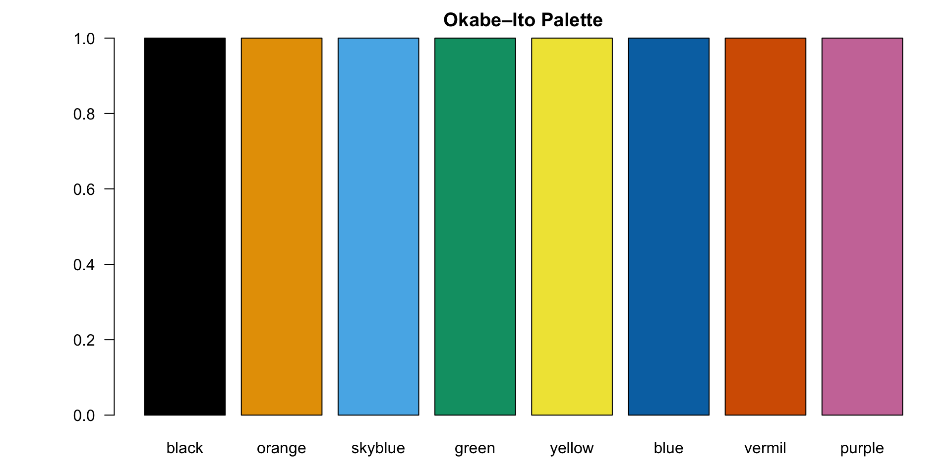
- Each bar represents one color from the palette
- Use this as a quick sanity check in your own environment
- Good slide to show your audience the actual colors
Using Okabe–Ito in Base R Plots
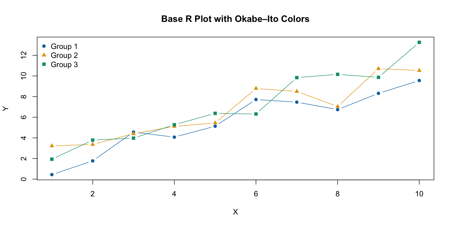
- Use colors via
okabe_ito["name"]for readability - Combine with different
pchshapes for extra distinguishability
Using Okabe–Ito in ggplot2 (Manual Scales)
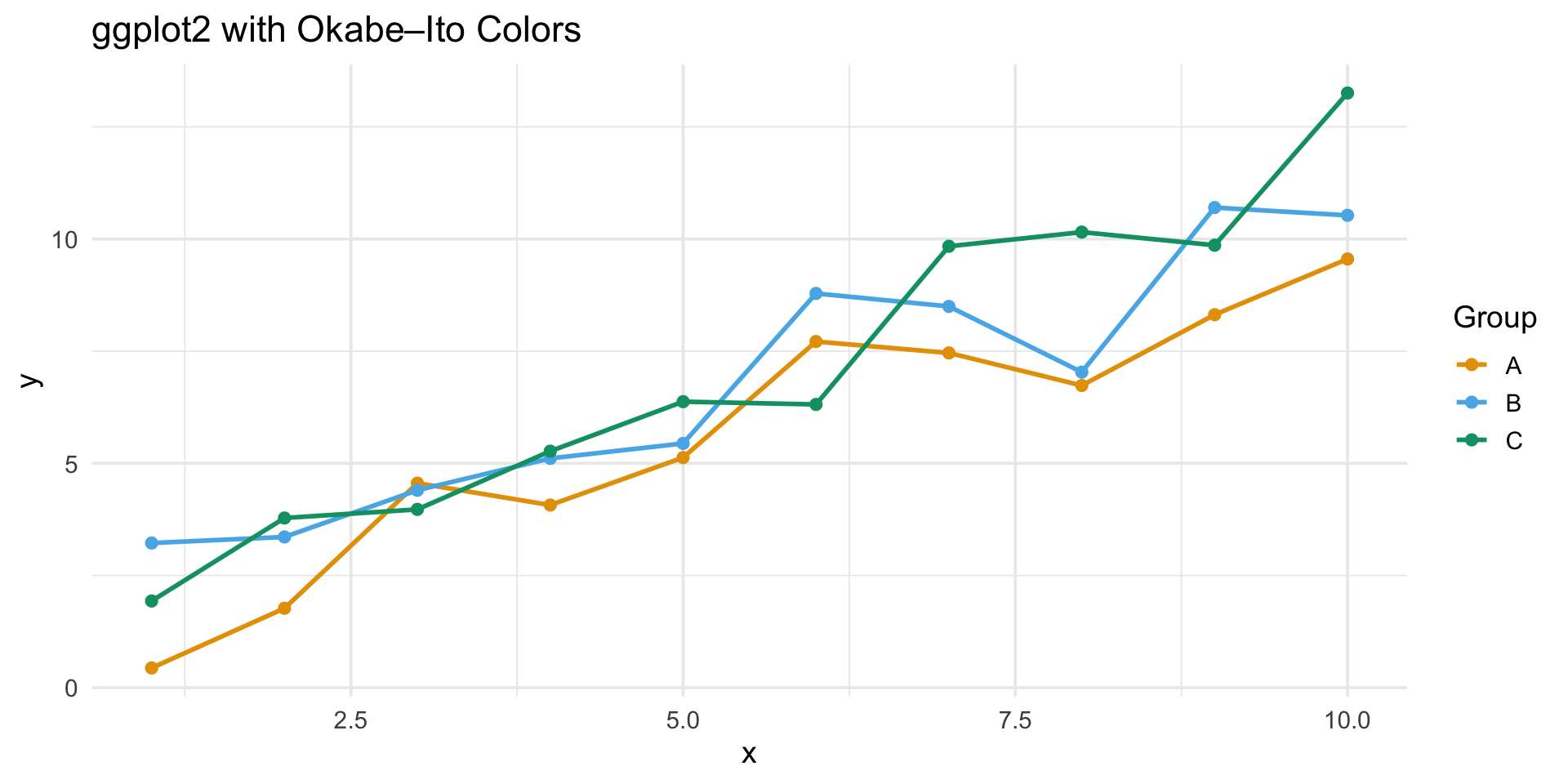
scale_color_okabe_ito()fromlibrary(ggokabeito)is the simplest way to apply the palette- Choose a subset of colors based on the number of groups
- Keep the mapping consistent across figures
Good Practices When Using Okabe–Ito in R
Use no more than 6–8 colors in a single plot if possible
Combine color with:
- Shape (
pch) - Line type (
linetype) - Faceting (
facet_wrap,facet_grid)
- Shape (
Keep color assignments consistent across plots:
- e.g.,
Group Ais always blue
- e.g.,
Document the palette and mapping in your code:
- Improves reproducibility
- Makes collaboration easier
In Summary
Okabe–Ito is a colorblind-safe, publication-ready palette
Easy to implement in R as:
- A simple vector
- A palette function
- Manual color / fill scales in ggplot2
Great for:
- Line plots
- Bar plots
- Scatter plots
- Multi-panel figures
Adopting accessible color choices is a small change with a big impact.