Visualizing Data in R with Default Package: Histograms
Asst. Prof. Dr. Somsak Chanaim
International College of Digital Innovation, CMU
June 23, 2026
How to Select the Chart?
Choosing the right chart depends on the type of data you have and the message you want to convey. Below are general guidelines:

Represents the distribution of a continuous dataset.
Useful for understanding the underlying frequency distribution of continuous or discrete data.
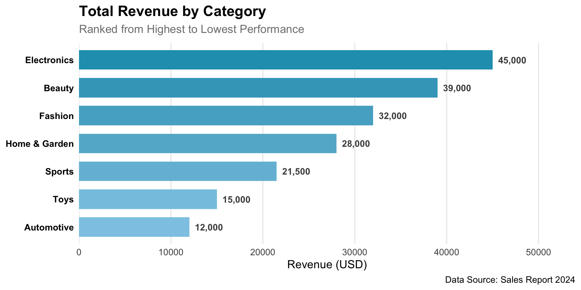
Used to compare values across categories.
Helpful for showing trends over time or comparing values across groups.
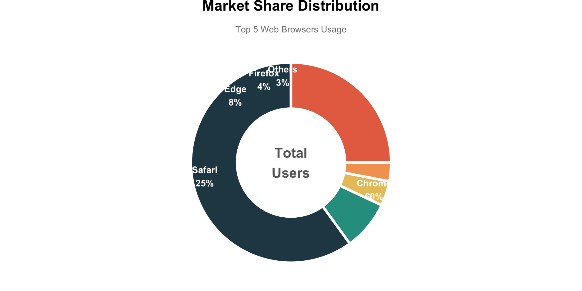
Suitable for showing proportions of a whole.
Avoid using more than 5–7 categories, as it becomes difficult to interpret.
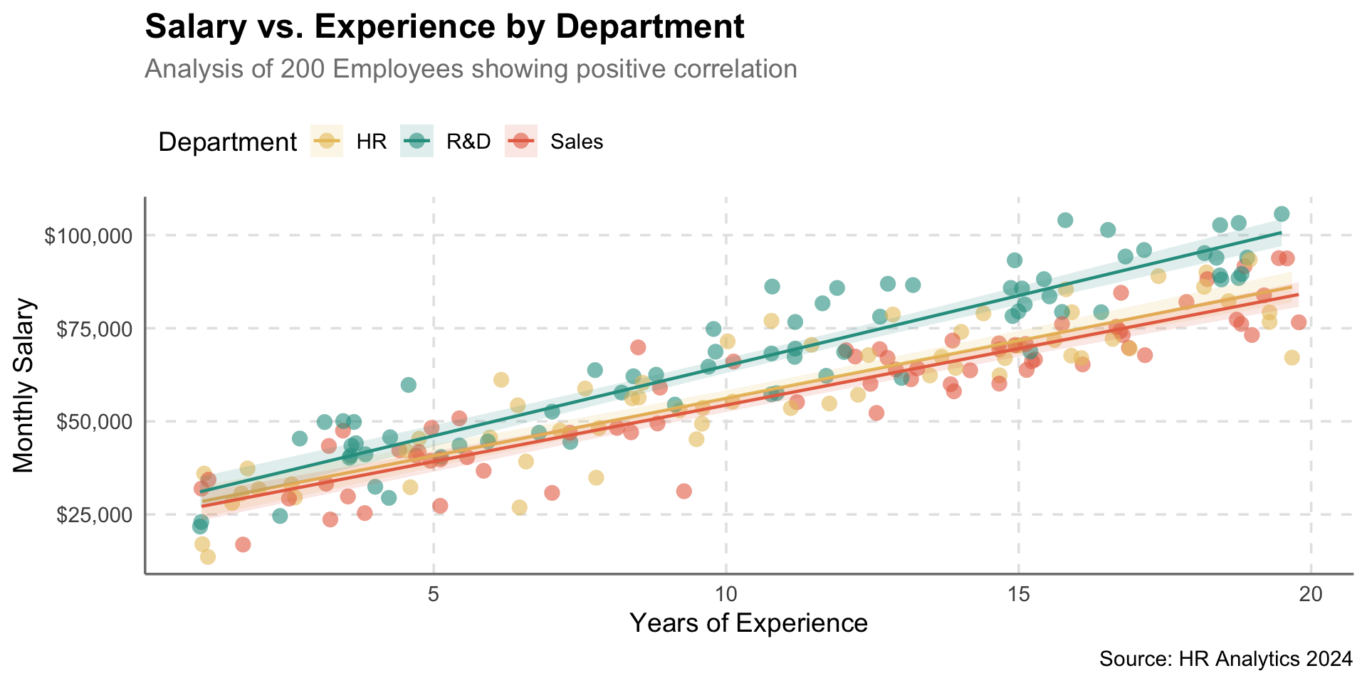
Displays the relationship between two variables.
Helps identify patterns and outliers.
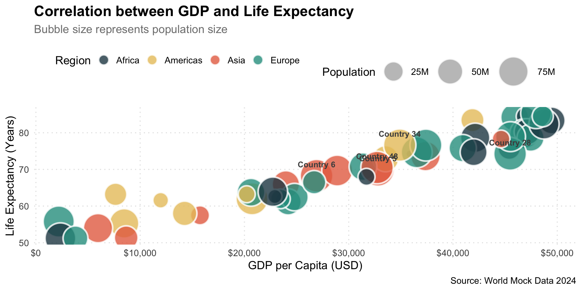
Represents three dimensions of data: x-axis, y-axis, and bubble size.
Useful for showing relationships among three variables.
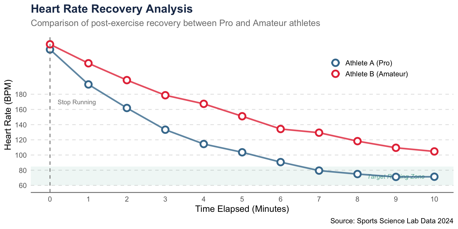
Ideal for showing trends and changes over continuous intervals (e.g., time, temperature).
Useful when displaying multiple series.
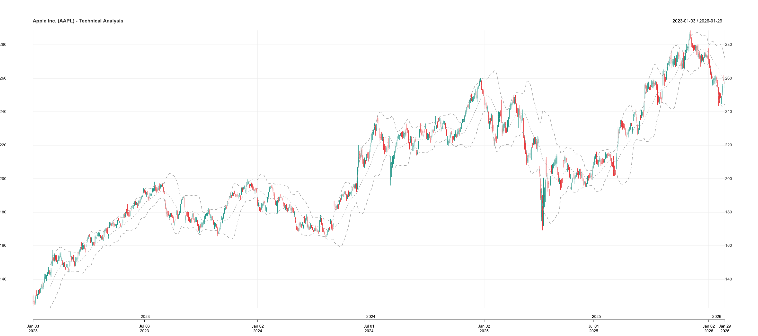
Used for technical analysis of financial data.
Highlights trends, price momentum, etc.
When choosing a chart, consider the nature of your data, the story you want to tell, and your audience.
Experiment with different chart types and select the one that best communicates your message
For further reading, visit https://r-graph-gallery.com
The Components of a Statistical Graph
Key components typically found in statistical graphs include:
Axes: Horizontal (X) and vertical (Y) reference lines.
Data Points: Markers representing values.
Lines and Curves: Show trends in continuous data.
Bars: Represent category values in bar graphs.
Title and Labels: Provide context and explain axes.
Symbols: Distinguish datasets (shapes, colors).
Legend Explains symbols and colors.
Color: Enhances clarity and highlights information.
Gridlines: Help interpret values.
Scale: Defines numerical values on axes.
Tick Marks: Mark intervals on axes.
Frame: The boundary enclosing the graph.
A well-designed statistical graph improves clarity and communication.
Histogram
A histogram is a bar chart that displays the frequency distribution of data within specified intervals (bins).
The x-axis shows value ranges.
The y-axis shows frequency counts.
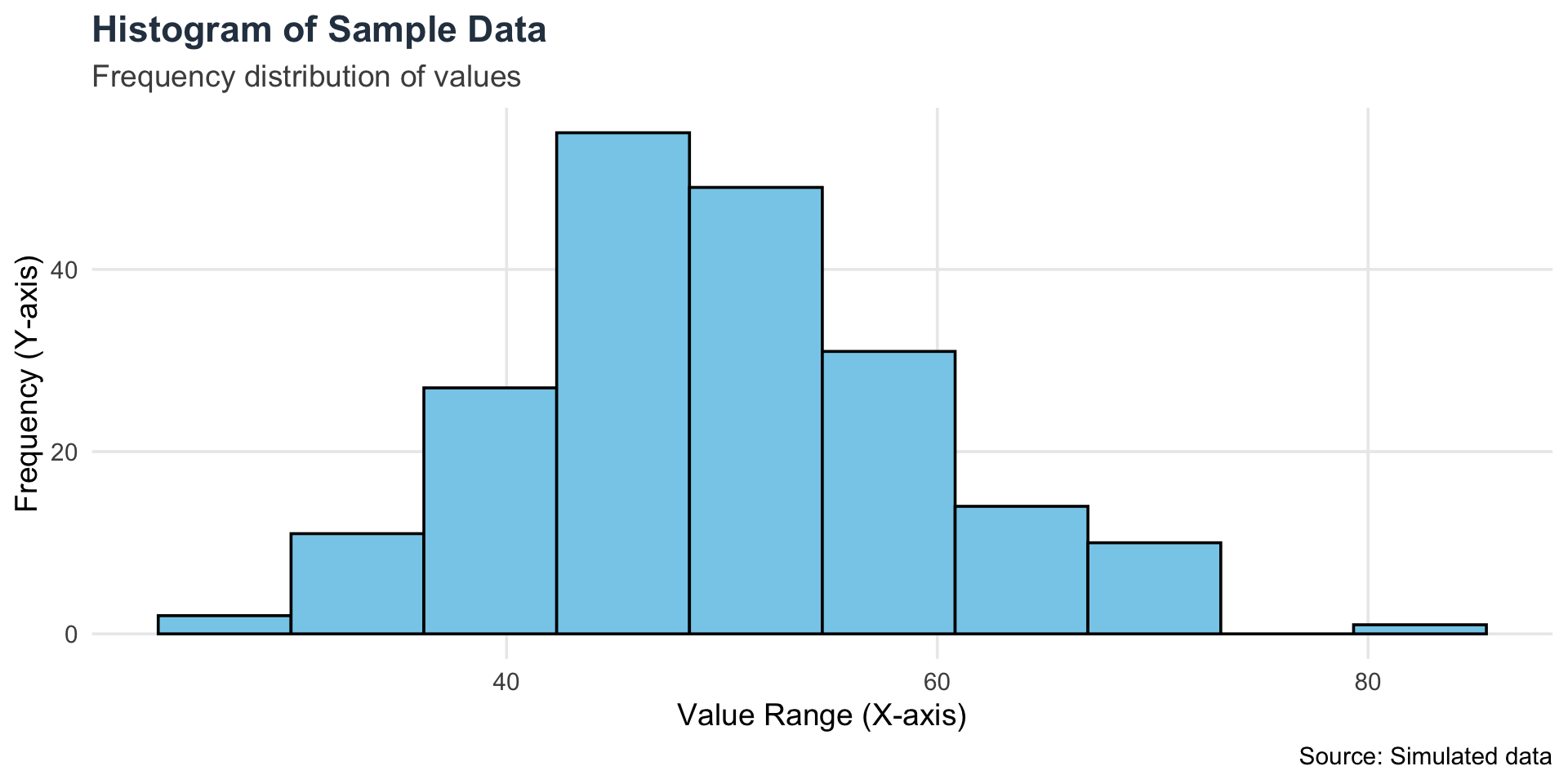
How a histogram is typically constructed:
Data Collection: Gather a set of data that you want to analyze.
Divide into Intervals (Bins): Divide the range of the data into intervals or bins. Each bin represents a specific range of values.
Count Frequencies: Count the number of data points that fall into each bin.
Create Bars: Draw bars above each bin on the histogram. The height of each bar corresponds to the frequency of data points in that bin.
Histograms are useful for identifying symmetry, skewness, and data spread.
Interactive example 1
viewof histType = Inputs.radio(
  [
    "Basic Histogram",
    "Histogram with Color",
    "Histogram with Labels",
    "Histogram with Density Curve",
    "Histogram with Two Groups",
    "Histogram with Rug Plot",
    "Histogram with Custom Bins"
  ],
  { label: "Histogram Types", value: "Basic Histogram" } // 👈 เอา inline: true ออกเพื่อแก้ Error
)
Interactive example 2
viewof N = Inputs.range([1000, 10000], {step: 100, label: "N"})
viewof myColor = Inputs.color({ label: "Choose a color", value: "#ff0000" })
viewof myText = Inputs.text({ label: "Enter text", placeholder: "Type title" })


viewof Choices = Inputs.radio([
  "✔️ Yes",
  "❌ No"
], { label: "Theoretical curve", value:
  "❌ No" })

viewof clicks = Inputs.button("Click to Random")
The hist() function
The hist() function in R is used to create a histogram, which is a type of plot that shows the distribution of a numeric variable.
key Arguments
| Argument | Description |
|---|---|
x |
A numeric vector (the data you want to plot) |
breaks |
Controls the number or placement of bins |
main |
Title of the plot |
xlab, ylab |
Labels for x- and y-axis |
col |
Fill color for the bars |
border |
Color of the borders around bars |
change the color
You can find the color names or the color hex codes fromhttps://www.color-hex.com
Try their hex colors
#fff8e7, #a8e4a0, #b2ec5d, #e8f48c, #bfefff, #e0ffff, #e0b0ff
Change the title
Change border color
#fff8e7, #a8e4a0, #b2ec5d, #e8f48c, #bfefff, #e0ffff, #e0b0ff
Aplication of the histogram
The mean-variance criteria
The mean-variance criteria is a decision-making approach commonly used in finance and investment theory, it was introduced by Harry Markowitz in 1952 and is a key component of modern portfolio theory (MPT).
The mean-variance criteria aims to optimize investment decisions by considering two key factors: the expected return and the volatility (or risk) of a portfolio.
Mean (Expected Return): This represents the average return an investor can expect from a portfolio. The higher the expected return, the better.
Variance (or Standard Deviation): This measures the volatility or risk associated with the returns of a portfolio. A lower variance indicates less risk.
The mean-variance criteria seeks to find the optimal portfolio by balancing these two factors. Investors are assumed to be risk-averse, meaning they prefer portfolios with higher returns and lower risk.
Draw the two histograms in the same plot
Work or not work?
How to solve?
We need to put the argument add = TRUE into the second hist() function.
Question
If you run the code for return.stock3 how to made 3 histogram into the same plot?
Add legend
You can choose the position by “topleft”, “bottomleft”, “topright”, or “bottomright”.
Add box
The Density Plot
A density plot is a smoothed version of a histogram that shows the probability density of a continuous variable.
In R, we can create a density plot using the base plot() and density() functions
Use pipe operator
Histogram + Density
Add argument probability = TRUE into hist() function
xlab: This argument sets the label for the x-axis in a plot.ylab: This argument sets the label for the y-axis in a plot.lwd: This stands for “line width” and controls the thickness of lines in a plot. The default line width is lwd = 1, and increasing this value will make the line thicker.
Density + Histogram
Histogram + Density
xlim: This argument sets the limits (range) of the x-axis. It takes a vector of two numbers, where the first number is the lower limit and the second is the upper limit.ylim: This argument sets the limits (range) of the y-axis. It also takes a vector of two numbers, specifying the lower and upper limits.lty: This stands for “line type” and controls the style of lines in a plot. It accepts integers or character strings representing different line styles. Common lty values:lty = 1 or “solid”: A solid line (default).
lty = 2 or “dashed”: A dashed line.
lty = 3 or “dotted”: A dotted line.
lty = 4 or “dotdash”: A dot-dash line.
lty = 5 or “longdash”: A long-dash line.
lty = 6 or “twodash”: A two-dash line.
Extra Topic: Add another color to histogram.
If we need to use the red color for x > 1.75

Extra Topic: Add another color to histogram.
Step 1: Create a histogram without plot by assign the plot object to new variable and use the argument plot = FALSE in the hist() function
Step 2: select the midpoint from object h, In this case we select 1.75. and use the plot() function.
Exercise 1: Basic Histogram Architecture
Complete the executable code block to load the dataset, reference the target variable, and assign the proper structural axis labels.
Target output
Complete the code
(mtcars)
hist(mtcars$,
main = "Histogram of Miles Per Gallon",
= "Miles Per Gallon",
= "Frequency",
col = "lightblue",
border = "black")
hist(mtcars$,
main = "Histogram of Miles Per Gallon",
= "Miles Per Gallon",
= "Frequency",
col = "lightblue",
border = "black")
Hint: Initialize the environment using the data() function. To isolate a specific column vector, append the targeted column name after the dataset identifier. Use the native 'xlab' and 'ylab' arguments to configure the graphical axis labels.
viewof var_ex1_basic_histogram_1 = html`<input type="text" class="ojs-hidden-ex1_basic_histogram" data-ojs-proxy="ex1_basic_histogram::var_ex1_basic_histogram_1" value="">`
viewof var_ex1_basic_histogram_2 = html`<input type="text" class="ojs-hidden-ex1_basic_histogram" data-ojs-proxy="ex1_basic_histogram::var_ex1_basic_histogram_2" value="">`
viewof var_ex1_basic_histogram_3 = html`<input type="text" class="ojs-hidden-ex1_basic_histogram" data-ojs-proxy="ex1_basic_histogram::var_ex1_basic_histogram_3" value="">`
viewof var_ex1_basic_histogram_4 = html`<input type="text" class="ojs-hidden-ex1_basic_histogram" data-ojs-proxy="ex1_basic_histogram::var_ex1_basic_histogram_4" value="">`
viewof var_ex1_basic_histogram_run = html`<input type="number" class="ojs-hidden-ex1_basic_histogram" data-ojs-run="ex1_basic_histogram" value="0">`
Exercise 2: Bin Width Configuration Strategy
Complete the code architecture to investigate how modifying the visual breakpoints alters the shape of the data distribution.
Target output
Complete the code
(iris)
hist(iris$,
= 15,
main = "Histogram of Sepal Length (15 bins)",
xlab = "Sepal Length",
col = "lightcoral",
border = "black")
hist(iris$,
= 15,
main = "Histogram of Sepal Length (15 bins)",
xlab = "Sepal Length",
col = "lightcoral",
border = "black")
Hint: Initialize the environment with data(). Isolate the column name vector exactly as specified (case-sensitive). Use the native 'breaks' parameter to control the total number of cell bins.
viewof var_ex2_adjusting_bin_width_1 = html`<input type="text" class="ojs-hidden-ex2_adjusting_bin_width" data-ojs-proxy="ex2_adjusting_bin_width::var_ex2_adjusting_bin_width_1" value="">`
viewof var_ex2_adjusting_bin_width_2 = html`<input type="text" class="ojs-hidden-ex2_adjusting_bin_width" data-ojs-proxy="ex2_adjusting_bin_width::var_ex2_adjusting_bin_width_2" value="">`
viewof var_ex2_adjusting_bin_width_3 = html`<input type="text" class="ojs-hidden-ex2_adjusting_bin_width" data-ojs-proxy="ex2_adjusting_bin_width::var_ex2_adjusting_bin_width_3" value="">`
viewof var_ex2_adjusting_bin_width_run = html`<input type="number" class="ojs-hidden-ex2_adjusting_bin_width" data-ojs-run="ex2_adjusting_bin_width" value="0">`
Exercise 3: Graphical Color Customization
Complete the script to construct a custom numerical vector, plot its distribution, and apply specific aesthetic color properties to the histogram bars.
Target output
Complete the code
weight <- (58, 62, 67, 70, 73, 75, 80, 85, 90, 95, 100, 105, 110)
hist(weight,
main = "Histogram of Weight",
xlab = "Weight (kg)",
ylab = "Frequency",
= "skyblue",
= "black")
hist(weight,
main = "Histogram of Weight",
xlab = "Weight (kg)",
ylab = "Frequency",
= "skyblue",
= "black")
Hint: Utilize the native combine function 'c()' to collect the numeric observations into a vector. To modify the aesthetics of the plot, assign color values to the 'col' and 'border' arguments inside the hist() function call.
viewof var_ex3_customizing_colors_1 = html`<input type="text" class="ojs-hidden-ex3_customizing_colors" data-ojs-proxy="ex3_customizing_colors::var_ex3_customizing_colors_1" value="">`
viewof var_ex3_customizing_colors_2 = html`<input type="text" class="ojs-hidden-ex3_customizing_colors" data-ojs-proxy="ex3_customizing_colors::var_ex3_customizing_colors_2" value="">`
viewof var_ex3_customizing_colors_3 = html`<input type="text" class="ojs-hidden-ex3_customizing_colors" data-ojs-proxy="ex3_customizing_colors::var_ex3_customizing_colors_3" value="">`
viewof var_ex3_customizing_colors_run = html`<input type="number" class="ojs-hidden-ex3_customizing_colors" data-ojs-run="ex3_customizing_colors" value="0">`
Exercise 4: Density Estimation and Rug Plots
Complete the script to render a probability density histogram, overlay a continuous density line estimation, and append a baseline rug plot.
Target output
Complete the code
data(mtcars)
hist(mtcars$mpg,
= FALSE,
main = "Histogram with Density and Rug Plot",
xlab = "Miles Per Gallon",
ylab = "Density",
col = "lightgray",
border = "black")
((mtcars$mpg),
col = "red",
lwd = 2)
(mtcars$mpg)
hist(mtcars$mpg,
= FALSE,
main = "Histogram with Density and Rug Plot",
xlab = "Miles Per Gallon",
ylab = "Density",
col = "lightgray",
border = "black")
((mtcars$mpg),
col = "red",
lwd = 2)
(mtcars$mpg)
Hint: Set 'freq = FALSE' inside hist() to scale the Y-axis to density instead of counts. Use the lines() function to overlay layers, passing the density() transformation inside it as the core argument. Finally, invoke rug() to map the raw observations along the baseline.
viewof var_ex4_density_rug_plot_1 = html`<input type="text" class="ojs-hidden-ex4_density_rug_plot" data-ojs-proxy="ex4_density_rug_plot::var_ex4_density_rug_plot_1" value="">`
viewof var_ex4_density_rug_plot_2 = html`<input type="text" class="ojs-hidden-ex4_density_rug_plot" data-ojs-proxy="ex4_density_rug_plot::var_ex4_density_rug_plot_2" value="">`
viewof var_ex4_density_rug_plot_3 = html`<input type="text" class="ojs-hidden-ex4_density_rug_plot" data-ojs-proxy="ex4_density_rug_plot::var_ex4_density_rug_plot_3" value="">`
viewof var_ex4_density_rug_plot_4 = html`<input type="text" class="ojs-hidden-ex4_density_rug_plot" data-ojs-proxy="ex4_density_rug_plot::var_ex4_density_rug_plot_4" value="">`
viewof var_ex4_density_rug_plot_run = html`<input type="number" class="ojs-hidden-ex4_density_rug_plot" data-ojs-run="ex4_density_rug_plot" value="0">`
Exercise 5: Comparative Distribution Analysis
Complete the script to overlay two distinct numeric distributions onto a single graphical canvas and append a classification legend.
Target output
Complete the code
data(iris)
hist(iris$Sepal.Length,
col = rgb(1, 0, 0, 0.5),
main = "Histogram of Sepal Length and Sepal Width",
xlab = "Length/Width",
ylab = "Frequency",
border = "black")
hist(iris$Sepal.Width,
col = rgb(0, 0, 1, 0.5),
= TRUE,
border = "black")
("topright",
= c("Sepal Length", "Sepal Width"),
= c(rgb(1, 0, 0, 0.5), rgb(0, 0, 1, 0.5)))
hist(iris$Sepal.Length,
col = rgb(1, 0, 0, 0.5),
main = "Histogram of Sepal Length and Sepal Width",
xlab = "Length/Width",
ylab = "Frequency",
border = "black")
hist(iris$Sepal.Width,
col = rgb(0, 0, 1, 0.5),
= TRUE,
border = "black")
("topright",
= c("Sepal Length", "Sepal Width"),
= c(rgb(1, 0, 0, 0.5), rgb(0, 0, 1, 0.5)))
Hint: To force a secondary histogram layer onto an existing plot canvas, enforce 'add = TRUE'. Utilize the legend() function to instantiate a map key, specifying its content using the 'legend' character vector and matching the color palettes via the 'fill' argument.
viewof var_ex5_comparing_distributions_1 = html`<input type="text" class="ojs-hidden-ex5_comparing_distributions" data-ojs-proxy="ex5_comparing_distributions::var_ex5_comparing_distributions_1" value="">`
viewof var_ex5_comparing_distributions_2 = html`<input type="text" class="ojs-hidden-ex5_comparing_distributions" data-ojs-proxy="ex5_comparing_distributions::var_ex5_comparing_distributions_2" value="">`
viewof var_ex5_comparing_distributions_3 = html`<input type="text" class="ojs-hidden-ex5_comparing_distributions" data-ojs-proxy="ex5_comparing_distributions::var_ex5_comparing_distributions_3" value="">`
viewof var_ex5_comparing_distributions_4 = html`<input type="text" class="ojs-hidden-ex5_comparing_distributions" data-ojs-proxy="ex5_comparing_distributions::var_ex5_comparing_distributions_4" value="">`
viewof var_ex5_comparing_distributions_run = html`<input type="number" class="ojs-hidden-ex5_comparing_distributions" data-ojs-run="ex5_comparing_distributions" value="0">`