Pre-test: Data Visualization
Download Data from GOOGLE DRIVE
What is the mtcars Dataset?
The mtcars dataset is a built-in dataset in R that contains specifications and performance metrics for 32 car models from the 1973–74 Motor Trend US magazine. It is commonly used for statistical modeling and visualization practice.
Variables in mtcars
| Variable | Description |
|---|---|
mpg |
Miles/(US) gallon (fuel efficiency) |
cyl |
Number of cylinders |
disp |
Displacement (in cubic inches) |
hp |
Gross horsepower |
drat |
Rear axle ratio |
wt |
Weight (1000 lbs) |
qsec |
1/4 mile time |
vs |
Engine type (0 = V-shaped, 1 = straight) |
am |
Transmission (0 = automatic, 1 = manual) |
gear |
Number of forward gears |
carb |
Number of carburetors |
Use Cases (in business/engineering/automotive contexts)
Compare fuel efficiency across different engine types or transmission systems
Analyze relationship between weight and horsepower
Create predictive models for mileage
Visualize vehicle characteristics for marketing or design strategy
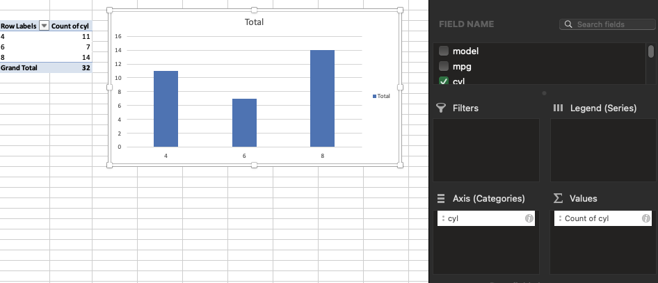
Use the mtcars sheet to create a plot.
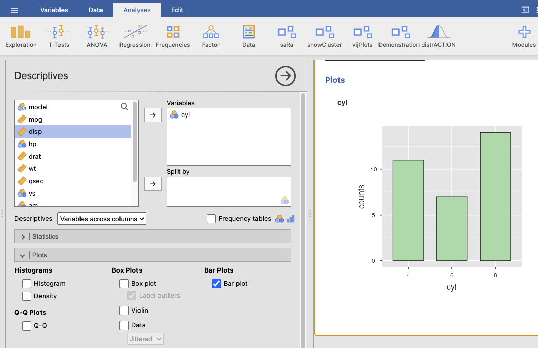
Bar plot of cyl
You can use:
Pivot Table: Insert → PivotTable → Drag Cylinders to Rows, and again to Values (set to “Count”).
Then insert the chart from that summary.
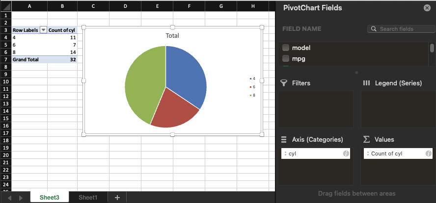
Pie plot of cyl
You can use: 1. Pivot Table: Insert → PivotTable → Drag Cylinders to Rows, and again to Values (set to “Count”).
- Then insert the chart from that summary.
Jamovi intentionally does not include pie charts due to statistical and visual perception issues. This choice is based on best practices in data visualization from statistical and cognitive research.
Reasons Why Pie Charts Are Discouraged:
Hard to compare angles: Humans are not good at judging angles or areas, especially when the slices are close in size. Bar charts are much easier to interpret.
Poor for many categories: When a pie chart has more than 4–5 categories, it becomes cluttered and hard to read.
No accurate axis: Pie charts don’t have a consistent baseline (unlike bar charts), which makes comparing values harder.
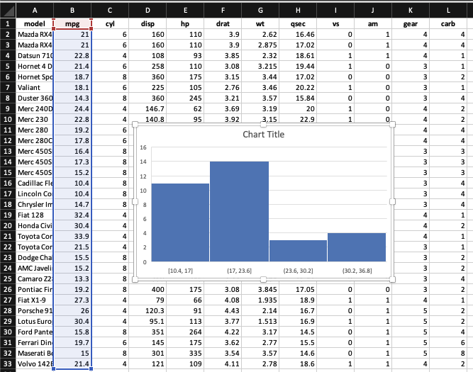
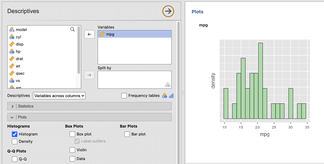
Histogram of mpg
Select the mpg column.
Go to the Insert tab.
In the Charts group, click on Insert Statistic Chart.
Choose Histogram.
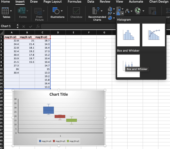
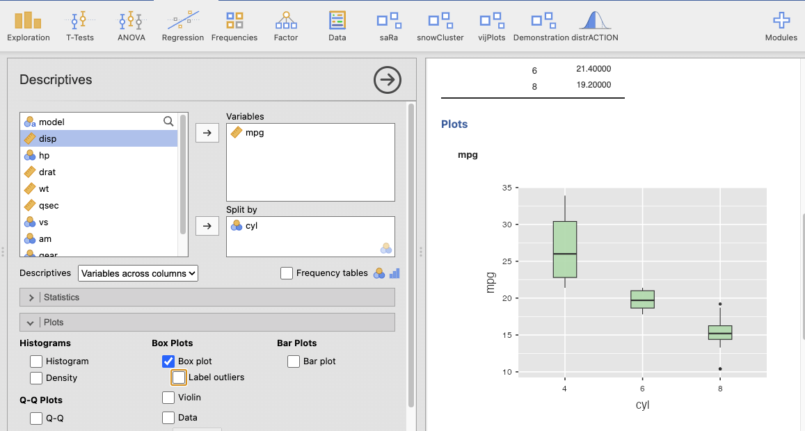
Box plot
Group the data by number of cylinders (cyl) and place the corresponding mpg values into columns as shown.
| mpg (4 cyl) | mpg (6 cyl) | mpg (8 cyl) |
|---|---|---|
| 22.8 | 21.0 | 18.7 |
| 24.4 | 21.4 | 14.3 |
| 22.8 | 18.1 | 16.4 |
| 32.4 | 19.2 | 17.3 |
| 30.4 | 17.8 | 15.2 |
| 33.9 | 19.7 | 10.4 |
| 21.5 | 15.5 | 10.4 |
| 27.3 | 14.7 | |
| 26.0 | 15.0 | |
| 30.4 | 13.3 | |
| 19.2 | ||
| 15.8 | ||
| 16.4 | ||
| 13.3 |
Select all data including headers (mpg (4 cyl), mpg (6 cyl), mpg (8 cyl)).
Go to the Insert tab.
Click on Insert Statistic Chart → Select Box and Whisker.
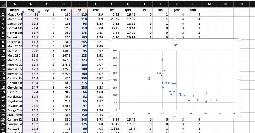
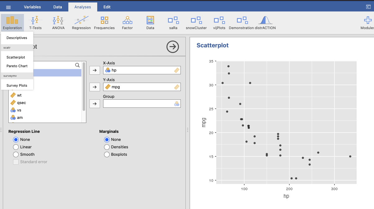
Scatter plot of Hp vs MPG
1.Select the two columns: hp (Horsepower) and mpg.
Go to the Insert tab.
In the Charts group, click Insert Scatter (X, Y) Chart.
Choose Scatter with only Markers (no lines).
Line plot
A line plot was created using the Gapminder sheet to visualize GDP per capita over time by country.
Use a PivotTable
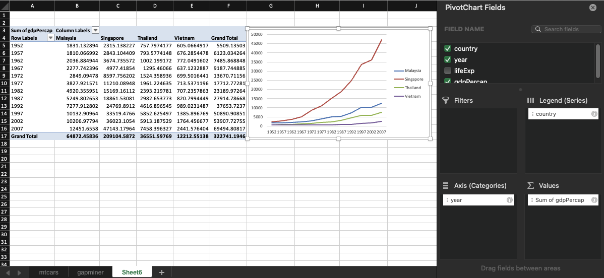
Currently, Jamovi does not support time series data analysis.